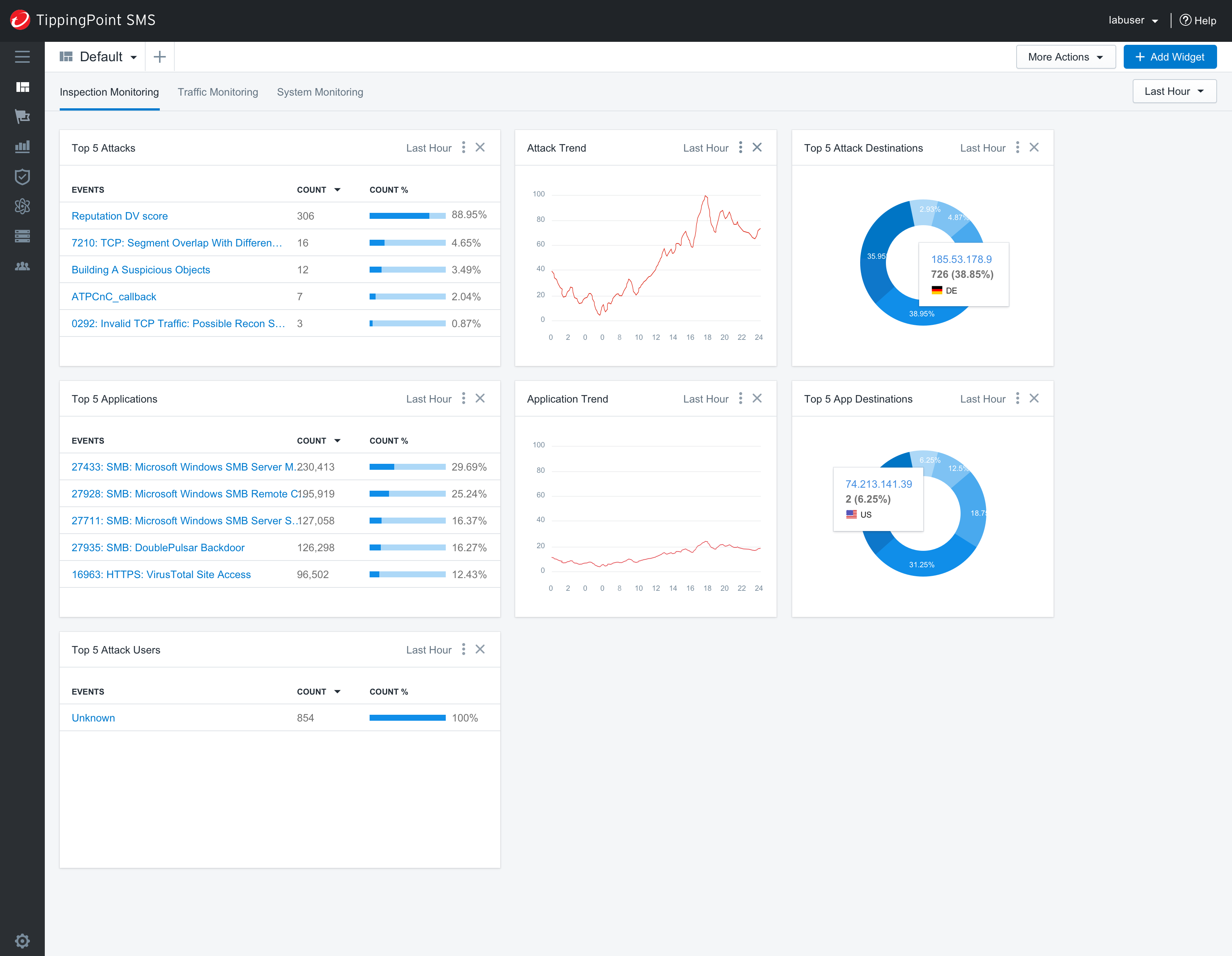
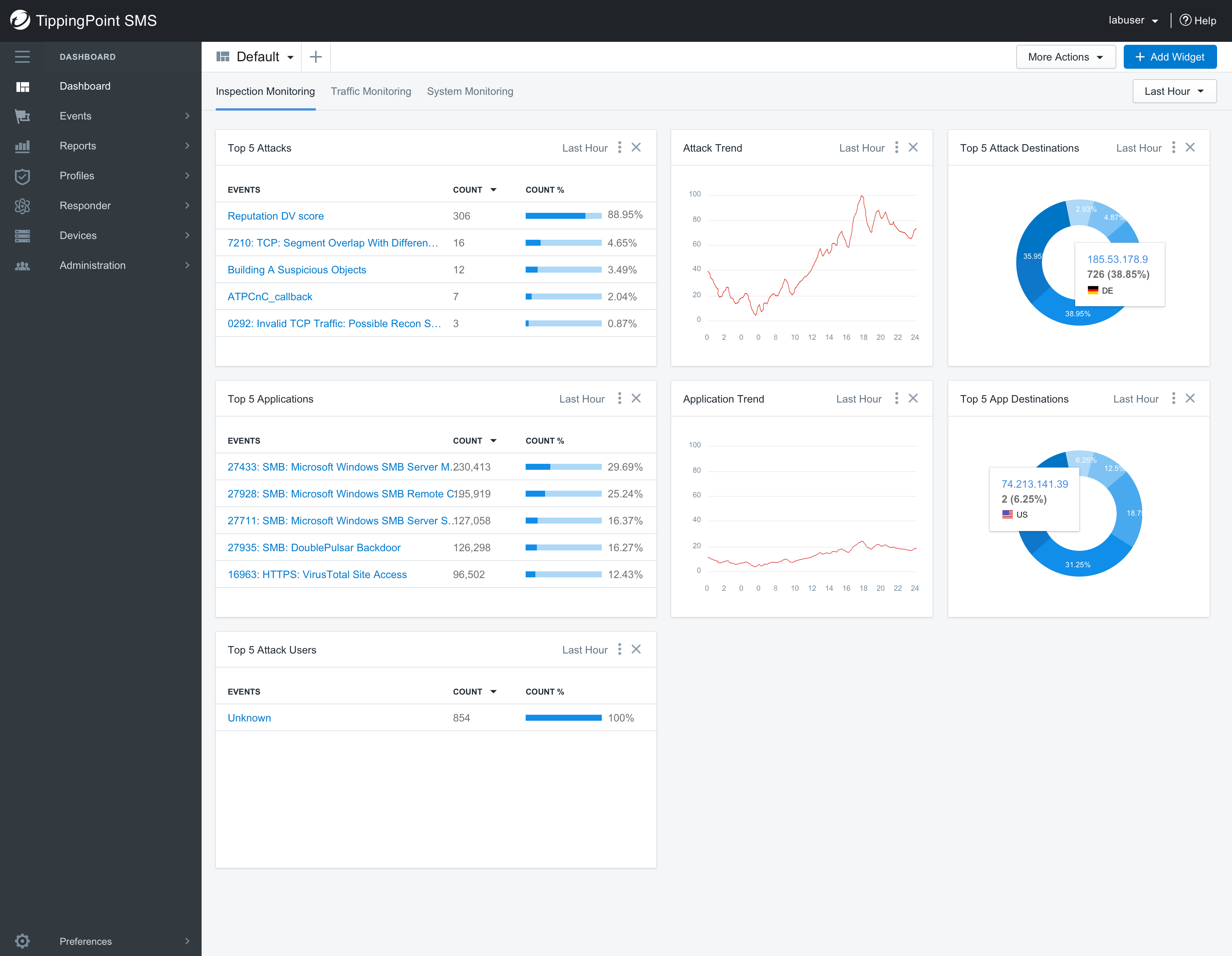
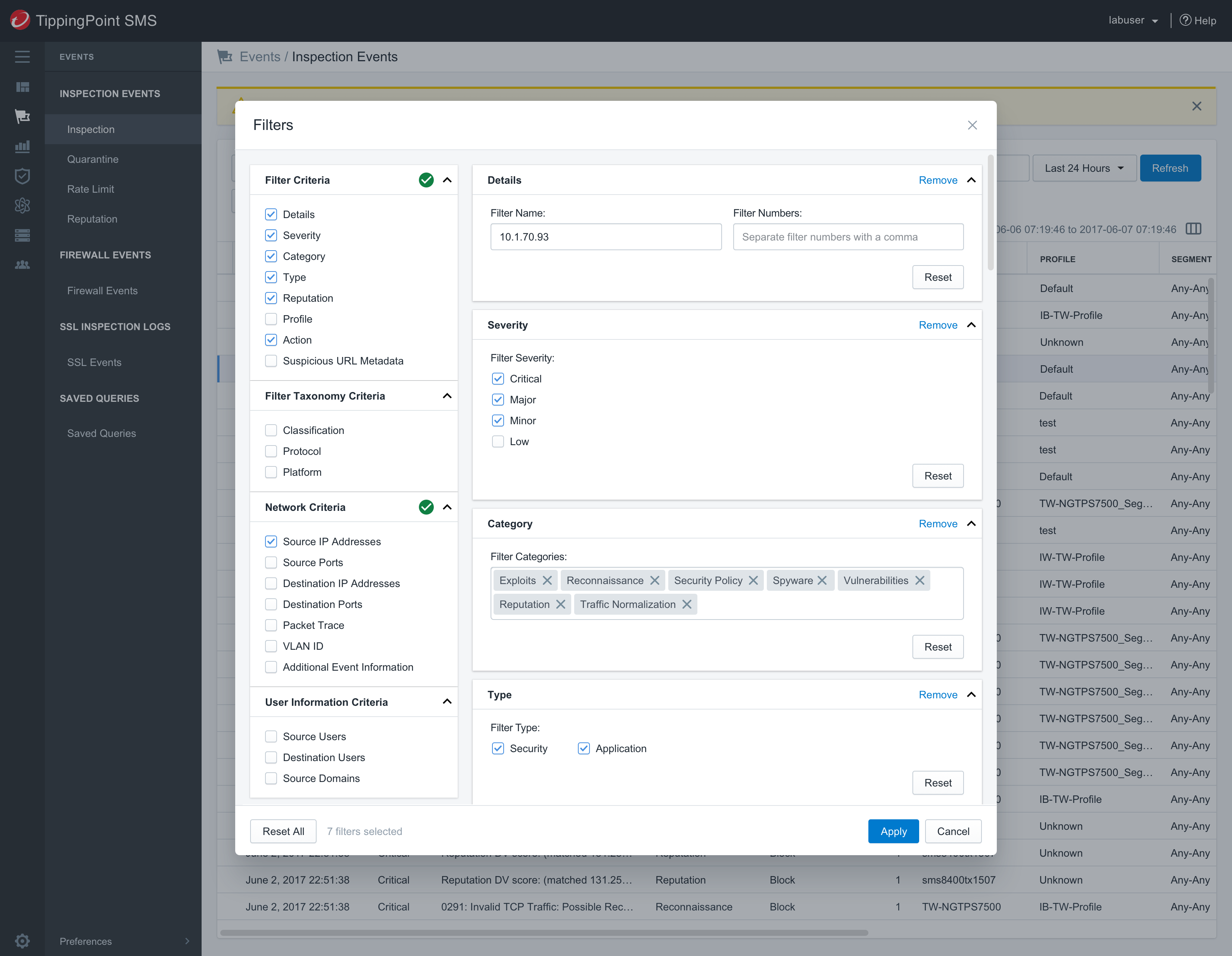
Another part of my goal was to persuade the team to redesign the SMS web console with a dark interface, mostly to match the
"premium" branding of TippingPoint IDS/IPS appliances, which are consistently placed in
Gartner's Magic Quadrant ™.
Another consideration for moving towards a dark interface was my general observation that the security industry was trending in that direction.
I also learned from conversations with our customers that they preferred to look at dark interfaces just because staring at security alerts at the dashboard on bright screens all day long can cause eye strain.
Lastly, a dark visual design offers a more content-focused experience, but is also futuristic, professional, slick, and cool looking.
Although many of these concepts were not implemented, they were still important to get the team excited about the future.